
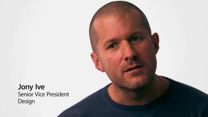
 Now that Jony Ive is heading up Apple’s design section, in his roles as head of Human Interface and leader of the Industrial Design departments, he will apparently stamp a distinctive style on the new version of iOS. Expected to be revealed in June at the Worldwide Developers Conference, it could be the biggest change ever to come to Apple’s remarkably successful OS.
Ive’s distinctive aesthetic style has been best implemented with the hardware Apple have produced. The flat, clean surfaces and industrial practicality had Ive written all over it. And now that he is in charge of the software design too, he will be looking to make the design more consistent between the two.
So what have we been told to expect?
If Ive’s history and other work is anything to go by, we’ll be seeing a cleaner, simpler OS. His minimalist style is what we’ve come to know and love from Apple in terms of hardware. It is more than likely that elements of this will come over into software too.
This is an assumption shared by many commentators and Apple-watchers, and backed up by comments made by people close to the Apple Senior Vice President of Industrial Design. Unnamed sources have claimed that interface elements could be dramatically changed, to fit more with Ive’s minimalist style.
Rather than focus on a few areas, Ive seems to have ordered a total overhaul to make the user experience more consistent throughout the product. One of the main areas which will see change according to sources close to Apple’s new creative leader will be textures, or rather the removal of them. iOS is famous for its skeuomorphism (texture-heavy interfaces), with yellow notepad paper in the Notes app, green felt in the Games section and a huge number of others designed to look real. It contrasts slightly with the plain, flat simplicity of Ive’s hardware, so it is only natural that this is the first area to be addressed. Sources claim that iOS 7 will see more “black, white and flat” features, with shadowing, transparent boxes and gloss all being removed.
Ive’s overhaul is aimed at creating a software design which stands the test of time, which the previous “designs filled with physical metaphors” do not. In addition, Ive is planning more consistent app design. The yellow paper of Notes and the blue/silver of Maps provide a confusing contrast for users , something Ive wants to eliminate.
The shiny, transparent time bar which sits at the top of the lock screen is apparently being replaced by an all-black, shine free bar. Some have speculated that app icons will be become clean, perfect squares, much like the icons on Windows Phone , though sources have maintained that Apple’s icons will remain rounded, but will lose their shine and shadowing. The comparison to Windows may be a simple assumption based on Ive’s minimalist approach to the makeover, but really it’s anyone’s guess.
The potential changes may worry some users. The existing iOS aesthetic is already very successful and has remained almost the same since the outset of the brand. Ive’s overhaul will be the first major change to Apple’s operating system since its inception.
Photo Credit: marcopako