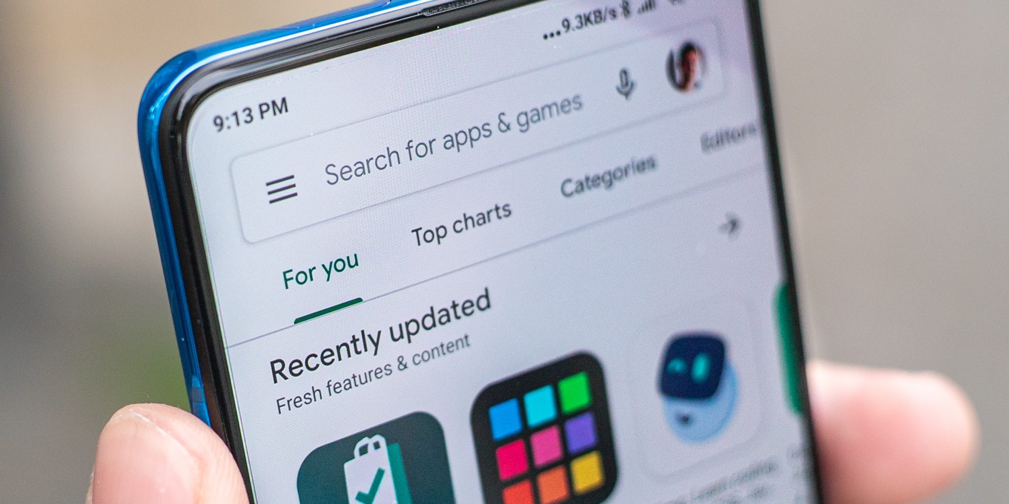
The Google Play Store for Android phones is set to reveal a new look in the next few weeks. Following the teaser message sent out on Google+ last week by Google designer Kirill Grouchnikov, the hashtag #soon had users looking forward to seeing the redesigned Play Store start appearing on their phones. A fresh new design is just what the Play Store needs to move on with the times and keep things from getting too stale in aesthetic terms, with some kind of improved functionality for consumers.
For some, the wait is over, as the updated Google Play is already appearing on their phones. From what we have seen, the Play Store’s look is not being totally revamped, but the new look boasts a fresh layout and less loading lag. The main change seems to be a different way to navigate between Apps and Games that is more user-friendly. Instead of the previous six sections in the old Play Store layout, there are now just two major divisions: Apps, Games and Entertainment. Each of the main sections will have subdivisions such as Top Charts and Categories to make it easier to find what you are looking for. As many game developers tag their games as apps, having Games and Apps together will make searching for both easier.
Under the Entertainment tab, you will find round buttons for Movies & TV, Music, Books and Newsstand rather than on the main store page. The buttons displace the scrolling tabs that were being used in older versions of the Play Store. From the Apps & Games tab, you can further click to Top Charts, Games, Family etc. Google has also changed the scrolling and animation for a smoother transition and to mask the lag in loading and scrolling by adding splash screens.
The Play Store is also seeing a reinvention of the carousel, showing featured content at the top of the screen that hasn’t been seen in the store for many versions (perhaps not since the Android Market existed as the predecessor of Play Store). This is probably the second major change to the Play Store. Games, Movies and other content are easy to flick through the many options showcased. The App recommendations are still lined along the bottom of the Play Store like before.
Other than the lumping together of categories, Google is also reported to be adding right-to-left languages support in the Play Store , as shown by pictures of the Play Store in Hebrew during last week’s sneak peak announcement for new design. This definitely opens up possibilities for developers and widens the user base.
On the other hand, the iOS app store has not seen any major upgrades or layout changes in the new iOS 9 release. Its last changes were algorithmic tweaks reported last summer to provide more quality content to users.
Tradebox Media are an award-winning software development agency based in Cardiff, UK.


